Your Success Is Our Mission.
WebDevStudios is a website design and development agency that builds robust solutions with WordPress, the platform that powers over 43% of the web. Leverage our design, technology, and strategy capabilities to deliver game-changing outcomes for your organization.
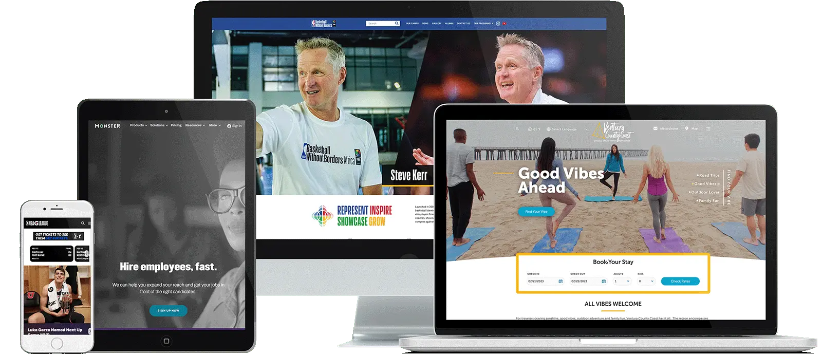
We Build Great Things with Great Clients


WordPress Services & Solutions
When everything clicks, great things happen.
WebDevStudios has WordPress service options and solutions for start-ups, medium-sized businesses, enterprise organizations, and marketing agencies. The ultimate goal at our WordPress website design and development agency is to help you achieve the best results.
At WebDevStudios, we’re not just a full-service WordPress shop; we’re your strategic partners in success. With the right blueprint, our website design and development agency paves the way to your success using WordPress to craft innovative web and mobile solutions.
Our comprehensive services cover everything from strategic planning and seamless design to development. This includes data migration, intricate API integrations, scalability, and performance optimization. What sets us apart is our unwavering commitment to staying ahead. Our entire team constantly learns and implements the latest WordPress best practices to ensure your website’s performance and security. Trust us for end-to-end WordPress solutions, tailored to your unique needs.
Our WordPress Services
-
Website Strategy
Expert advice goes a really long way on a complex project. Let our experts help guide the way through technical advice and direction, problem solving, and infrastructure consulting. How can our Strategy Team help you? -
UX/UI Design
Custom design services aren’t something we do for you, but something we do together. We do more than create a look. We connect with you and help you next-level your brand. Let’s create a digital footprint for your company that converts. Discover our approach. -
Custom WordPress Development
Secure, high quality code is just the start. We consider all the little details so your site is comprehensive. We take an innovative approach to make your site fast, secure, and reliable every step of the way. -
Ongoing Website Development & Support
Make our team of experts your team of experts. With an ongoing website development and support retainer, your WordPress website will always be updated, secure, and performant.


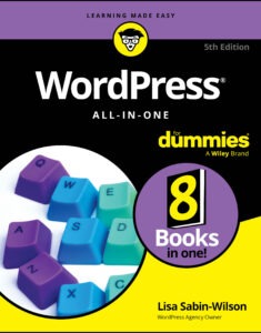
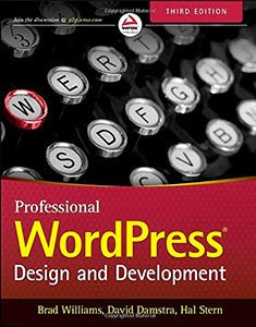
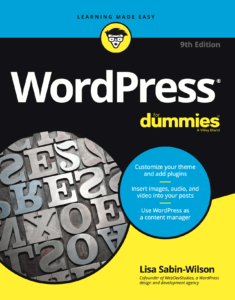
We Wrote the Book(s) on WordPress
WebDevStudios believes in the open-source nature of WordPress and sharing our knowledge. That's why for the past 10 years we've been writing books to help everyone from seasoned developers to bloggers new to the web to understand and harness the power of WordPress.